See’s Candies
$1.5 million engagement for a full site re-platforming and design.
Challenge
See’s Candies was ready to move to new CMS and ecommerce platforms.
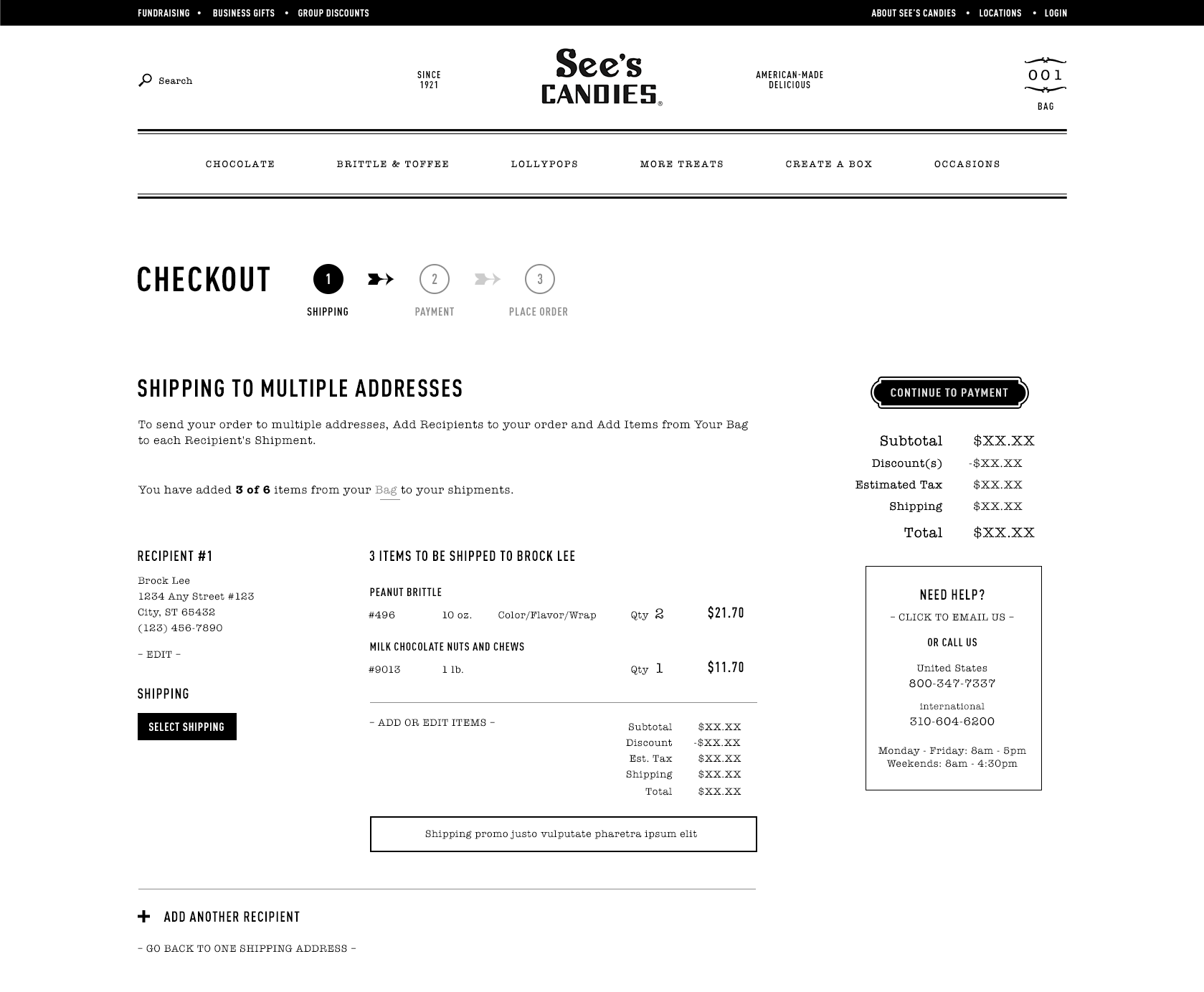
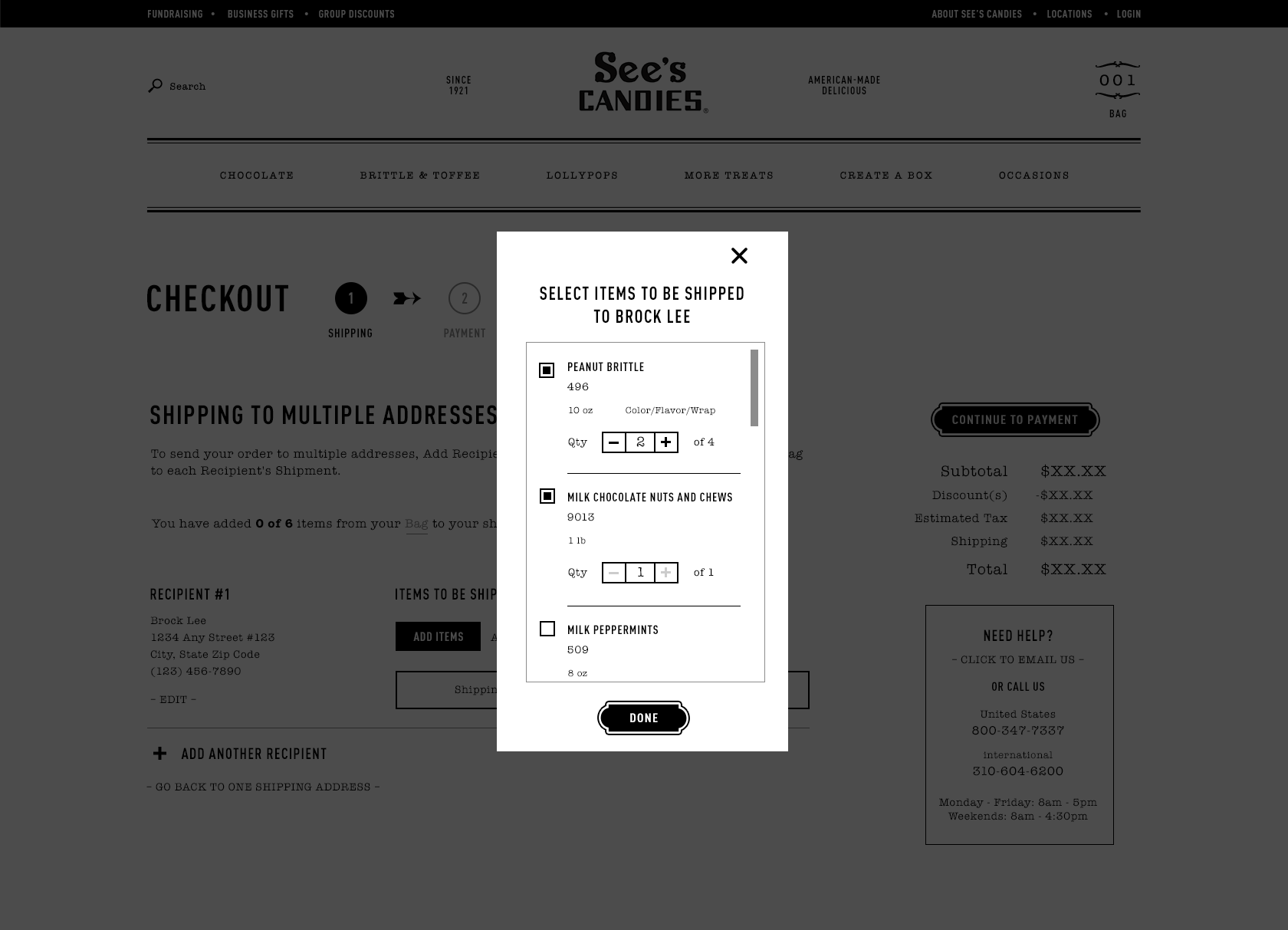
While I designed a number of ecommerce sites, See’s Candies broke many records—for products per order, online sales volume, and legacy business rules that were non-negotiable. On top of that, See’s serves an older user group that requires particular care.
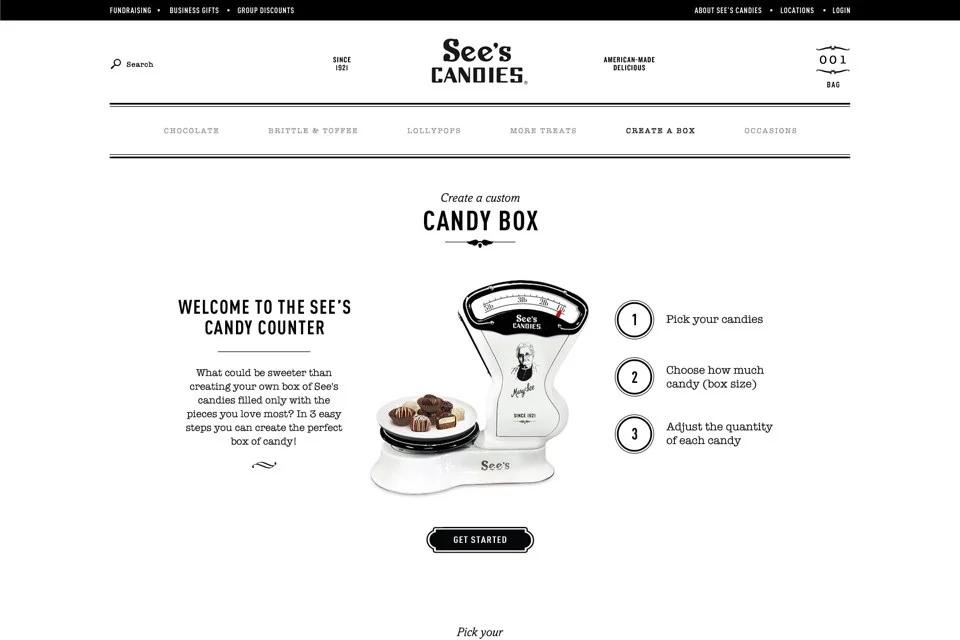
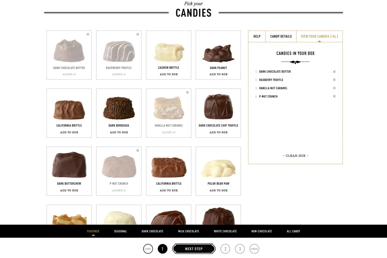
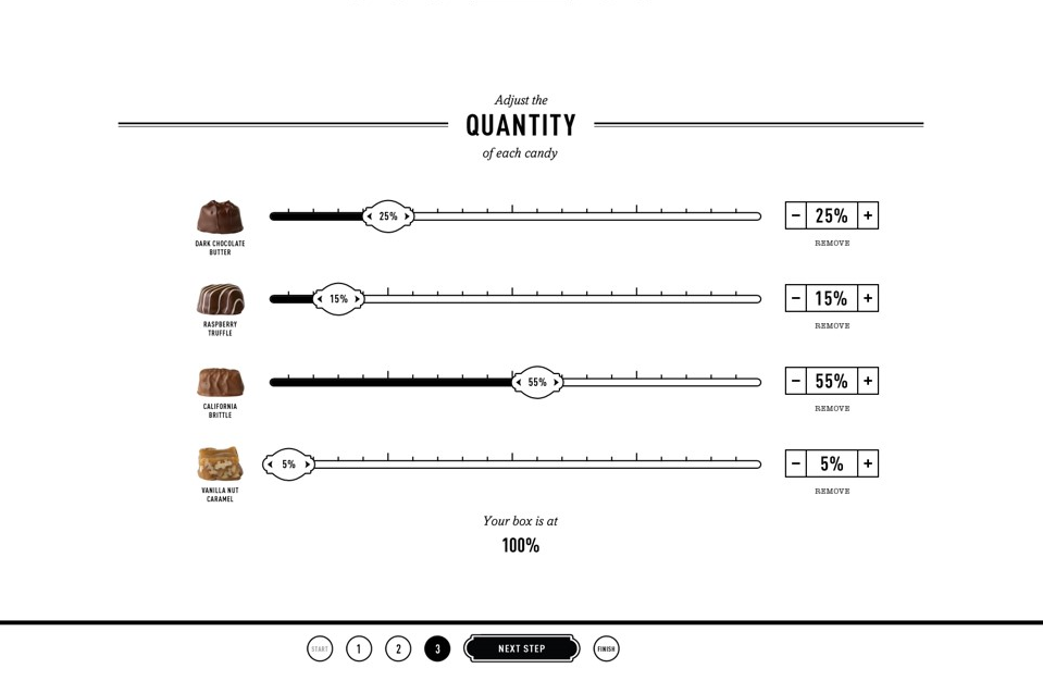
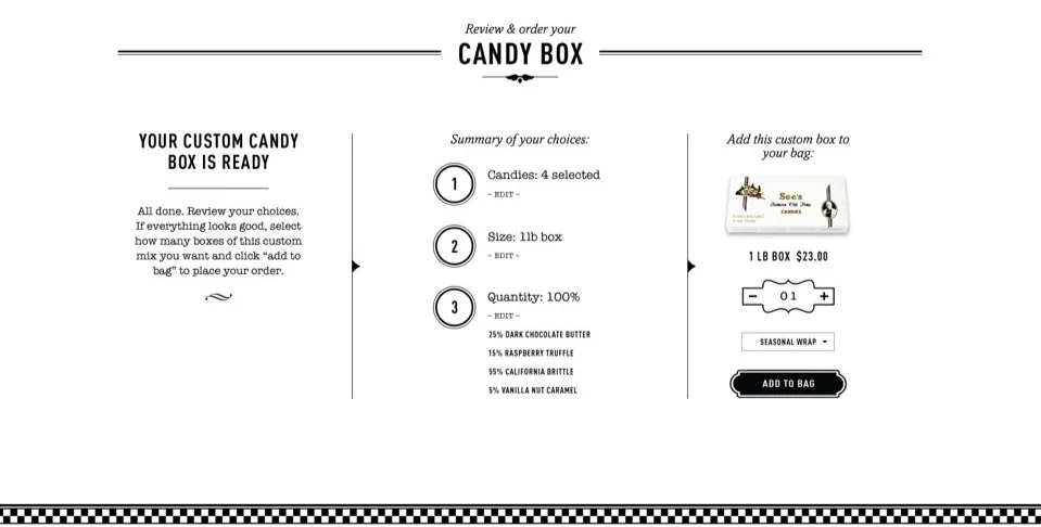
The flagship feature of the See’s experience is the creation of a custom candy box from dozens of options.
Hypothesis
Strong, simple design elements that are friendly to impaired motor skills and eyesight, work well on all form factors, and ultimately must be delightful will engage See’s clientele best.
Methodology
Design exploration with stakeholders using mood boards, competing homepage templates, and competitive analysis.
Full site map, wireframes for two form factors, user flows, and content tracking documents developed over 8 months.
Design templates for full site.
User testing of key product pieces in retail setting on two devices.
Solution
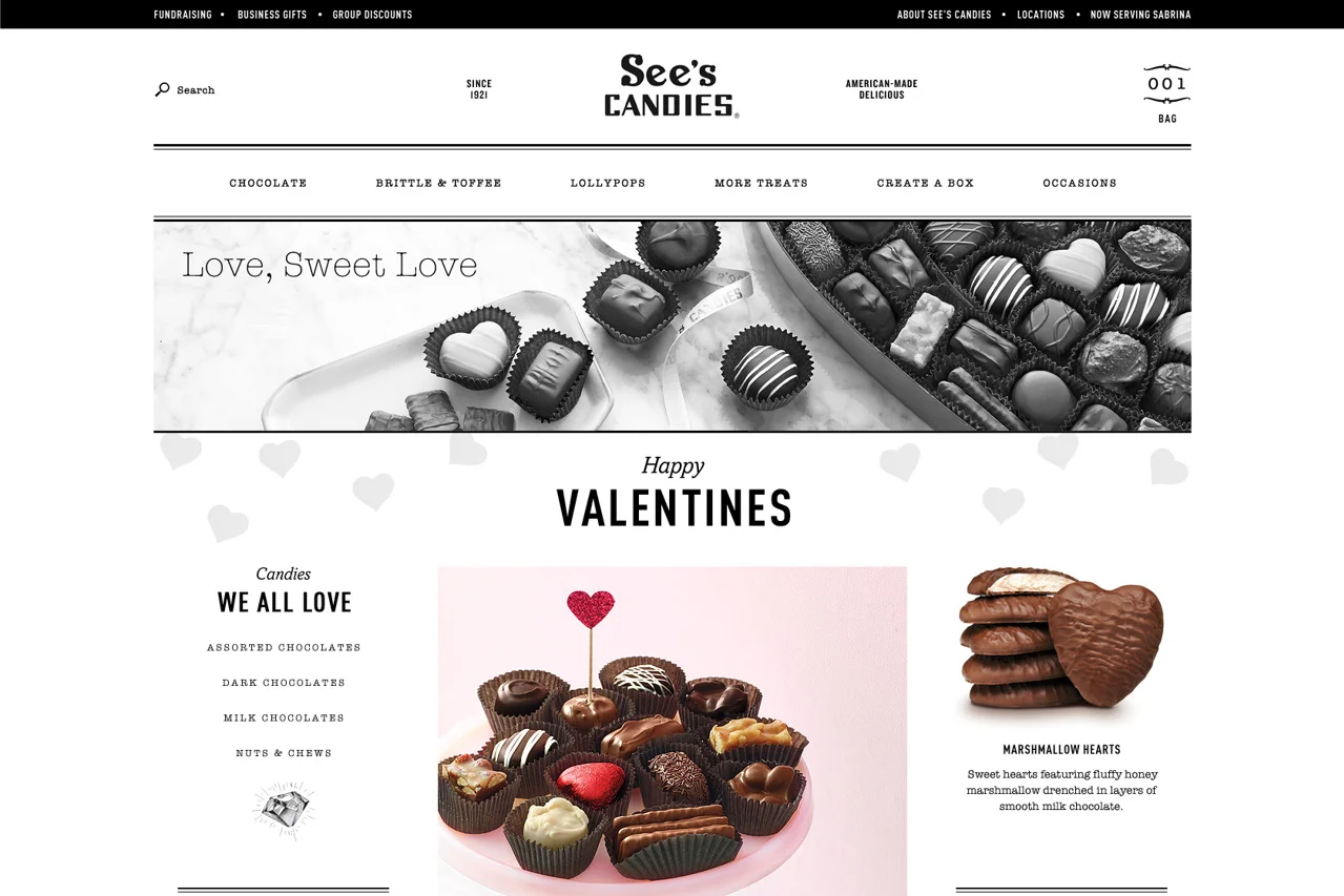
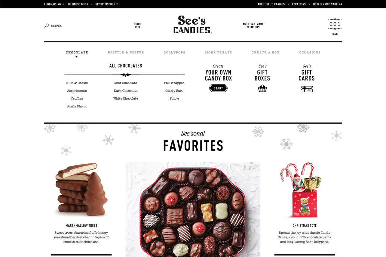
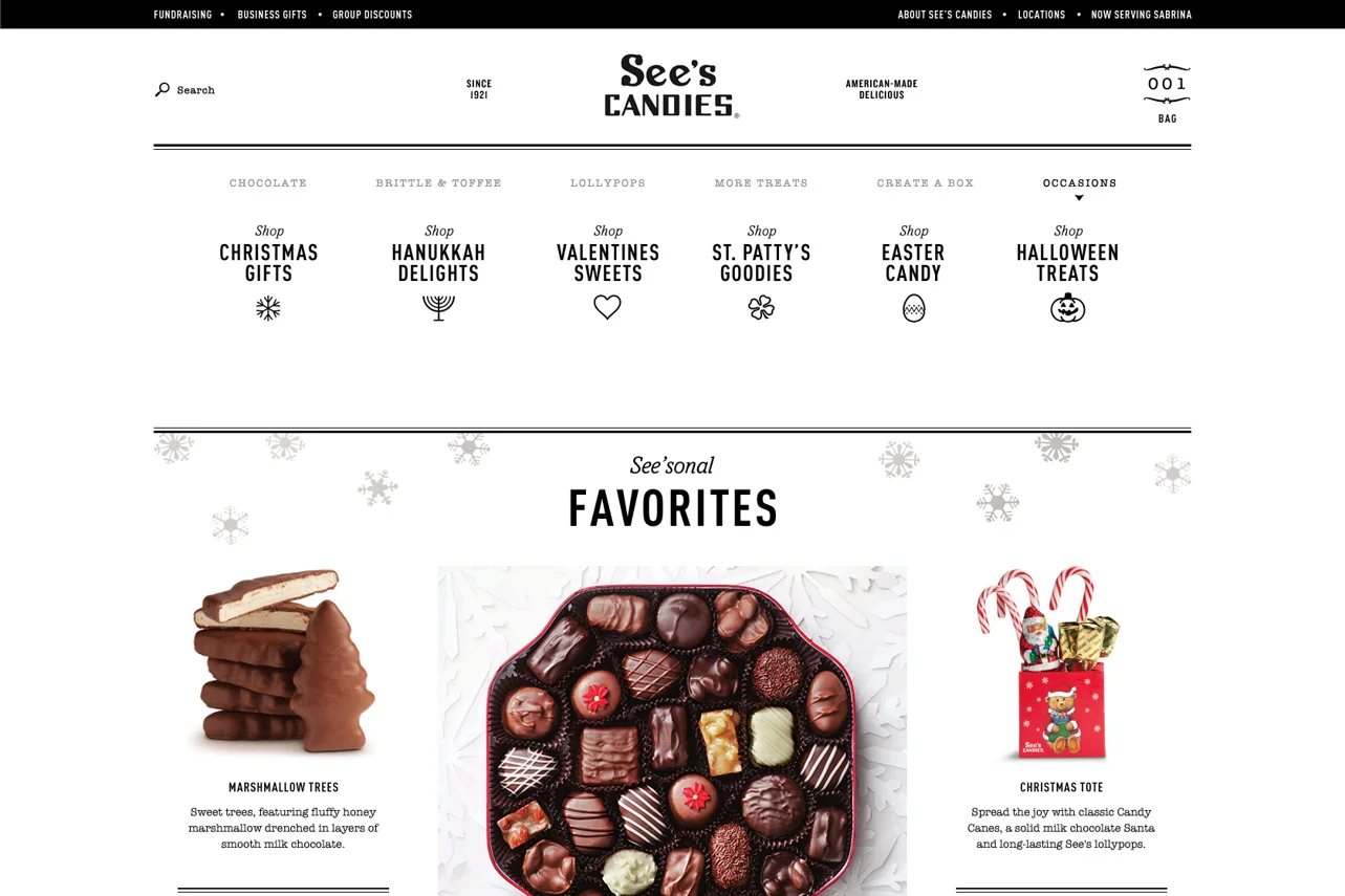
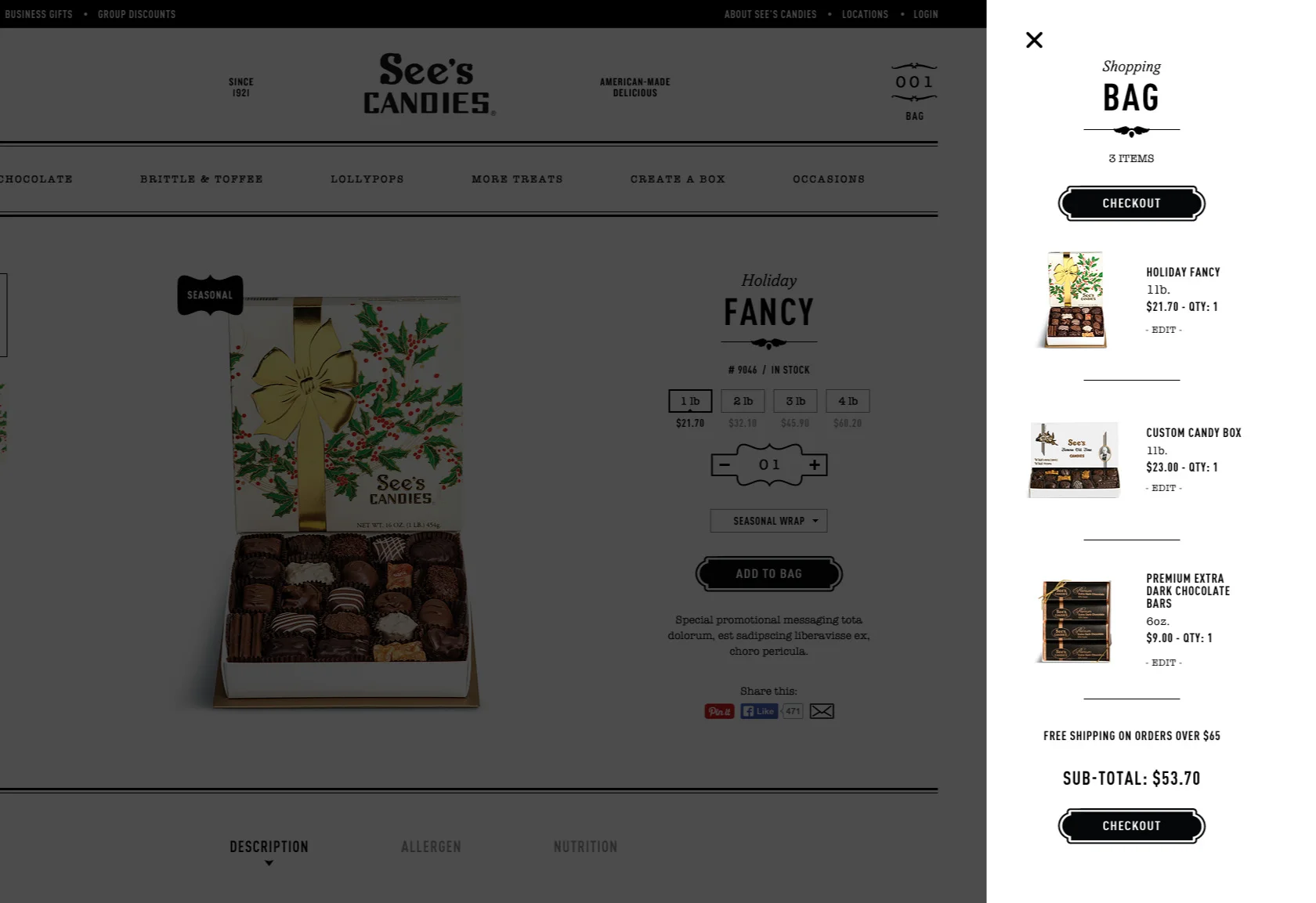
A classic black and white design language helps honor See’s brand while emphasizing clarity and legibility for maximum accessibility. It also served to place the emphasis on See’s packaging and historic photography.
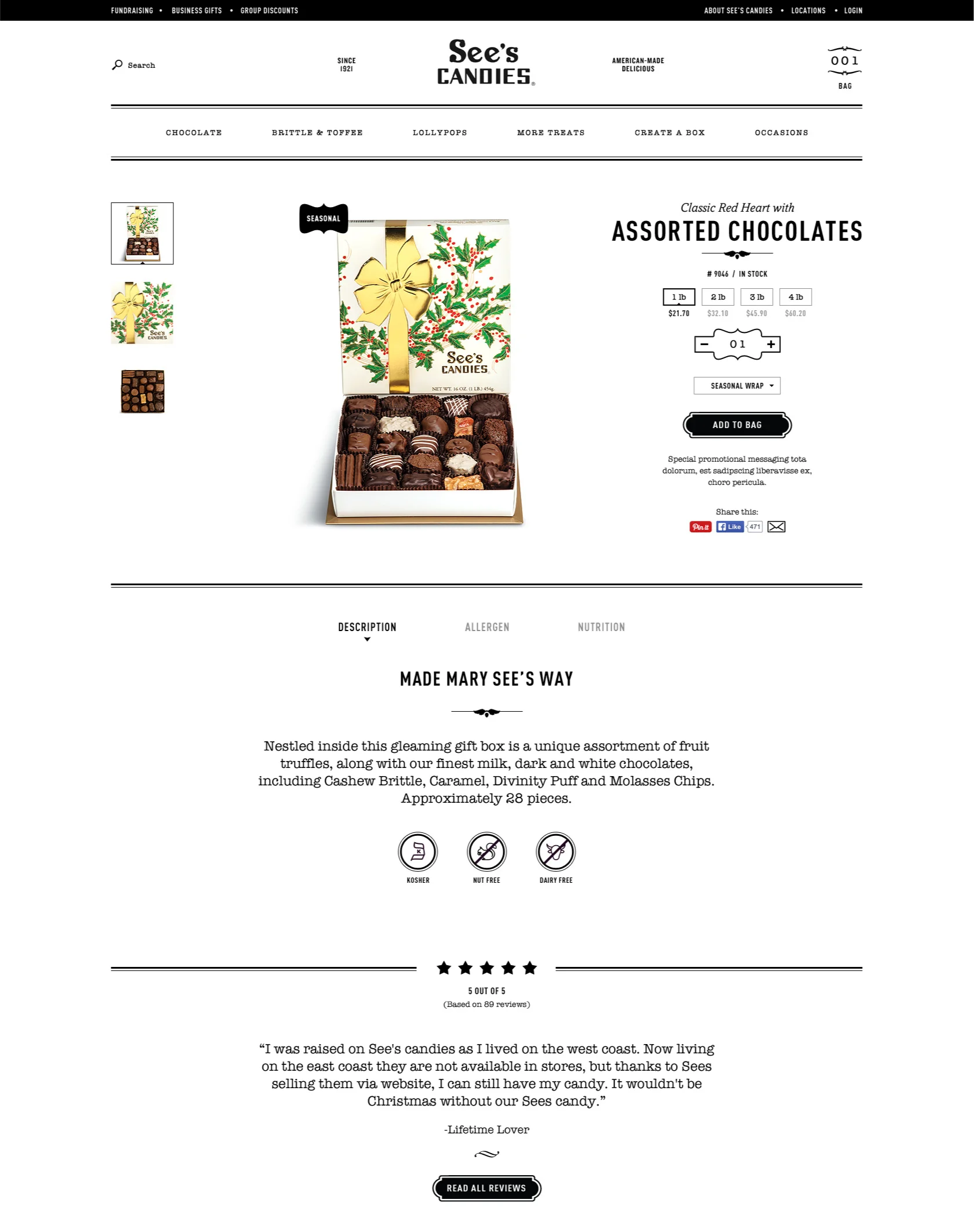
Various product models required nuanced product detail page templates and catalog functionality. Most unique was See’s Custom Mix candy box builder which was designed, deliberated, tested, and revised for ease of use whether the user was sending dozens of complex, unique mixes or just a single, simple half-and-half blend.
